Delivering Value from the Start
With over $450M in assets under management, 'tyba' had a major opportunity to boost conversion rates by improving its dashboard experience. The dashboard needed to do more than just display investment data—it had to drive engagement, encourage users to explore new products, and help them manage their portfolios more effectively.
On January 2nd, 2023, we launched a new dashboard experience, resulting in a 2.2X increase in conversion rates and a 140% growth in users with multiple investment products.
Company
tyba
Date
December 2022
Role
Sr. UX Designer
Team
PMs, Dev
Platform
App, Web

Background
With over 5,000 daily app downloads across Peru, Chile, and Colombia, 'tyba' was experiencing a low 8% conversion rate. Users who completed onboarding and reached the dashboard were not engaging with the platform as expected.
The dashboard’s disorganized data presentation created confusion for 63% of users, making it difficult for them to take action. Additionally, 94% of users had only invested in one product, missing opportunities to diversify their portfolios.
This revealed a critical opportunity: how could we create an experience that adapts to different user types while driving engagement and conversions?

Challenges & Key Insights

1. Information overload & lack of guidance
Users were overwhelmed by a disaggregated view of their investments, making it hard to assess overall performance.
Financial data lacked clarity, leading users to struggle with decision-making.

2. Underutilized dashboard for conversion
The dashboard wasn’t leveraging its strategic position within the product to encourage users to invest more.
Users weren’t engaging with CTAs due to poor placement and low visibility.

3. UI & branding issues
The excessive use of Tyba’s primary green color in backgrounds reduced readability.
The product showcase disappeared after the first investment, making it harder to promote new products.
Opportunity & Strategy
Create a clear, intuitive, and engaging experience that encourages product creation and increases interaction through smart CTAs.
To meet the business goal of a 20% conversion increase across all markets, we designed an experience that:
Guided users seamlessly through the dashboard with clear hierarchy and intuitive navigation.
Introduced a modernized visual style, aligning with current UX/UI best practices.
Incorporated storytelling elements to educate users and promote new investment opportunities.

Research & Methodology
🔍
Competitive benchmarking
Analyzed 50+ platforms to identify best practices in information hierarchy, usability, and engagement tactics.
📍
Customer journey mapping
Analyzed the full user journey from social media interactions to the dashboard experience to ensure consistent messaging.
🎯
User interviews
Conducted 10 in-depth interviews with existing customers to understand their expectations and pain points.
Discovered that prioritizing investments by category (rather than individual investments) would improve comprehension.
🧪
User testing & iteration
20 unmoderated usability tests helped refine navigation, hierarchy, and CTA placement.

Key Deliverables - Structuring the dashboard for maximum impact
A smarter entry experience
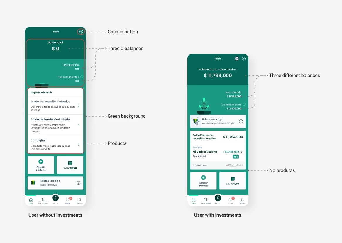
Since the dashboard is the first interaction after onboarding, we tailored it to two key user states:
New users → A simplified view highlighting Tyba’s value proposition and an investment CTA.
Existing users → A portfolio overview with interactive CTAs for portfolio management and new investments.


Improving navigation & information hierarchy
Consolidated investment balances by category to reduce cognitive overload.
Created a sticky top bar that keeps the investment balance and primary CTA always visible as users scroll.
Enhancing cross-selling opportunities
Previously, once users made their first investment, product discovery became hidden.
We redesigned the showcase section to remain accessible and dynamic, constantly suggesting relevant investment opportunities.


Visual improvements for better readability
Optimized color usage to maintain brand consistency while improving contrast and readability.
Refined typography, spacing, and iconography to create a cleaner, more modern feel.
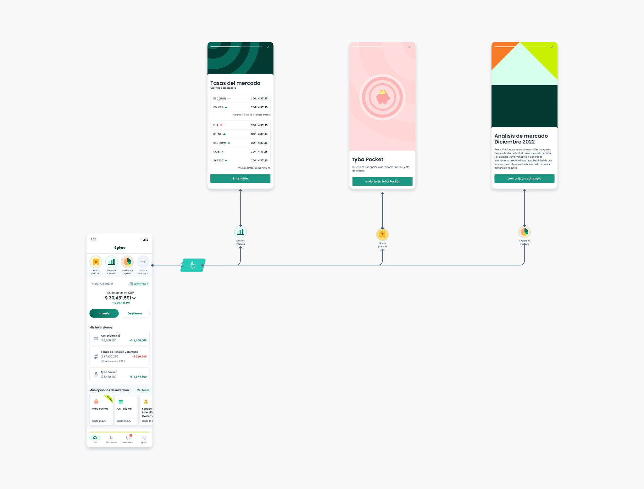
Stories: Driving engagement through content
To educate and retain users, we introduced Stories within the dashboard. These dynamic, user-specific content cards served to:
Explain investment concepts and benefits.
Promote new features and exclusive investment opportunities.
87% of users reported a better understanding of the product and navigation after interacting with Stories.


Conversion: The true north of the dashboard
The redesigned dashboard focused on driving action at every step:
Users always have access to investment CTAs, even when scrolling.
Balances and performance insights are easy to understand, encouraging faster decision-making.
The dashboard adapts to both new and experienced investors, ensuring long-term engagement.